
Block Builder
The BlockBuilder is the heart of page construction in Kompass. It gives you an intuitive interface for creating and managing content sections across your website — each block has its own Blade view, editable fields, and grid configuration.
Creating a New Block
Step 1: Create Block Template
Navigate to Admin > Blocks and click "New Block".
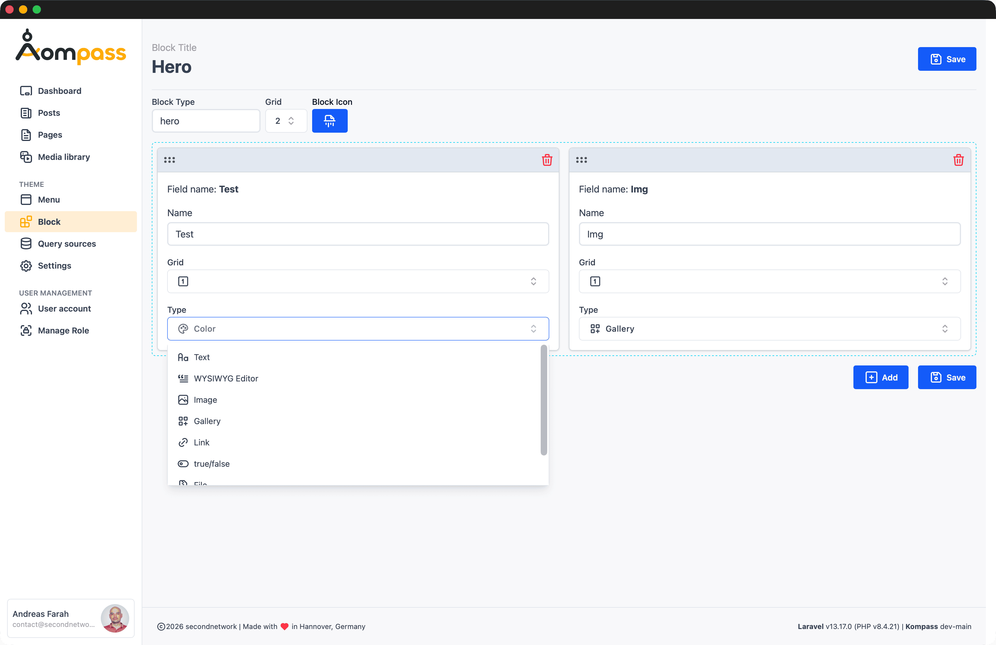
| Field | Required | Description |
|---|---|---|
| Name | Yes | Display name for the block |
| Type | Auto-generated | Unique identifier (slug format) |
When you save, Kompass generates a Blade view file at resources/views/components/blocks/{type}.blade.php.
Step 2: Edit Block View
Open the generated Blade file and customize the template:
@props(['item' => ''])

@if($item->type == 'my-custom-block')
<div class="my-custom-block {{ get_meta($item, 'css-classname', '') }}">
    @php
        $title = get_field('text', $item->datafield);
        $image = get_field('image', $item->datafield, 'w-full rounded');
        $link = get_field('link', $item->datafield);
        $link = $link ? json_decode($link) : null;
    @endphp

    @if($image)
        <div class="block-image">{!! $image !!}</div>
    @endif

    @if($title)
        <h2>{{ $title }}</h2>
    @endif

    @if($link)
        <a href="{{ $link->url }}" class="btn">{{ $link->title }}</a>
    @endif
</div>
@endif
Block Data Structure
Block Object Properties
| Property | Type | Description |
|---|---|---|
id | integer | Unique block identifier |
type | string | Block type identifier |
name | string | Display name |
layoutgrid | integer | Grid column span (1-12) |
grid | integer | Grid columns for galleries |
datafield | Collection | Collection of field values |
order | integer | Display order |
children | Collection | Nested child blocks (for groups/accordions) |
Block Meta Properties
Access meta values via get_meta($item, 'key') or $item->getMeta('key'):
| Key | Description |
|---|---|
css-classname | Custom CSS classes |
layout | Layout mode: fullpage, popout, content |
alignment | Text alignment: align-left, align-center, align-right |
id-anchor | HTML anchor ID for the section |
link-url | Optional wrapper link URL |
Available Block Types
Button Block
@props(['item' => ''])

@if($item->type == 'button')
@php
    $url  = get_field('text_url', $item->datafield);
    $text = get_field('text', $item->datafield);
    $icon = get_field('icon', $item->datafield);
@endphp
<div>
    <a class="btn inline-flex fill-current" href="{{ $url }}">
        {{ $text }}
        @if (!empty($icon))
            @svg($icon)
        @endif
    </a>
</div>
@endif
Card Block
@props(['item' => ''])

@if ($item->type == 'card')
@php
    $image = get_field('image', $item->datafield);
    $title = get_field('wysiwyg', $item->datafield);
    $text  = get_field('text', $item->datafield);
    $link  = get_field('link', $item->datafield);
    $link  = $link ? json_decode($link) : null;
@endphp
<div class="card {{ get_meta($item, 'css-classname', 'bg-white') }} rounded">
    <div class="card-body">
        @if($image) <x-image :id="$image" class="w-full rounded" /> @endif
        @if($text) <p>{!! $text !!}</p> @endif
        @if($link) <a href="{{ $link->url }}" class="btn btn-primary">{{ $link->title }}</a> @endif
    </div>
</div>
@endif
WYSIWYG Block
Rich text content rendered using the Kompass Editor block format. Use wysiwyg_blocks() to normalise the stored content before rendering — it handles both the current format and legacy Editor.js data:
@props(['item' => ''])

@if($item->type == 'wysiwyg')
@php
    $raw = get_field('wysiwyg', $item->datafield);
    $blocks = wysiwyg_blocks($raw);
@endphp

<div>
    @foreach($blocks as $block)
        @switch($block['type'])
            @case('paragraph')
                <p>{!! $block['content'] !!}</p>
                @break
            @case('h2')
                <h2>{!! $block['content'] !!}</h2>
                @break
            @case('ul')
                <ul class="list-disc pl-4">
                    @foreach($block['items'] as $li)
                        <li>{!! $li !!}</li>
                    @endforeach
                </ul>
                @break
            @case('blockquote')
                <blockquote>{!! $block['content'] !!}</blockquote>
                @break
        @endswitch
    @endforeach
</div>
@endif
See the Kompass Editor documentation for the full list of block types and rendering details.
Gallery Block
@props(['item' => ''])

@if($item->type == 'gallery')
<div class="md:grid gap-4 grid-cols-{{ $item->grid }}">
    @foreach($item->datafield as $image)
        <x-image :id="$image['data']" wire:key="gallery-{{ $item->id }}-{{ $loop->index }}" class="w-full h-full rounded-lg" />
    @endforeach
</div>
@endif
Group Block (Nested Blocks)
@props(['item' => ''])

@if ($item->type == 'group')
@php
    $layoutgrid = $item->layoutgrid ?? 12;
@endphp
<div class="group md:grid gap-6 grid-cols-{{ $layoutgrid }} {{ get_meta($item, 'css-classname', '') }}">
    @foreach ($item->children as $child)
        <x-blocks.components :item="$child" />
    @endforeach
</div>
@endif
Block Group Expand / Collapse
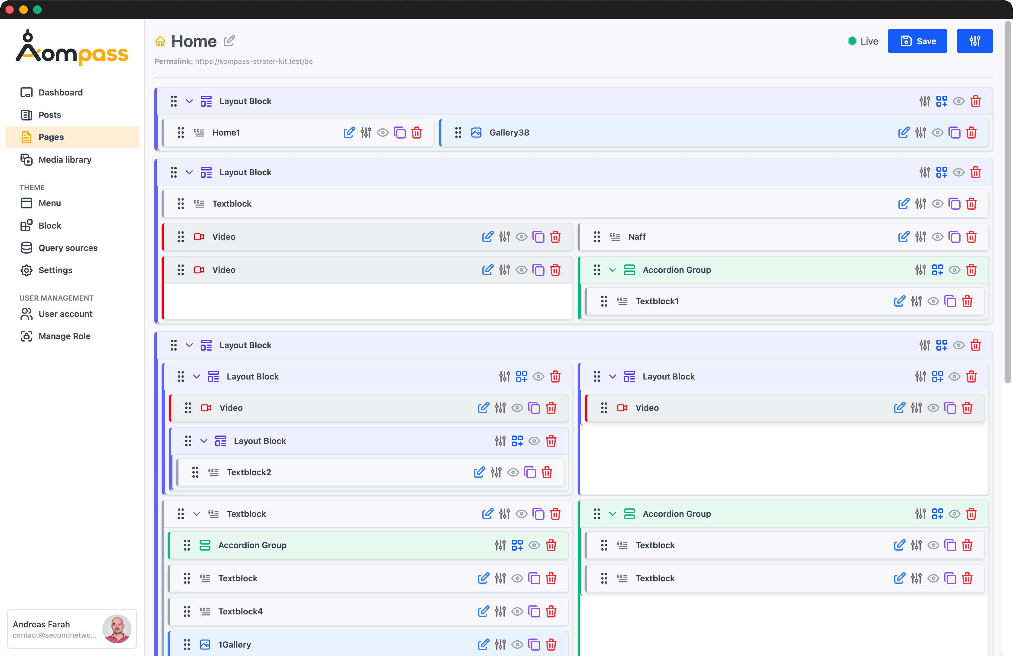
Block groups in the admin editor support interactive expand/collapse controls (added in v1.6.0). Each group has a toggle button with a rotating chevron icon, and a page-level Expand all / Collapse all button is available at the top of the block editor.
Groups are colour-coded by hierarchy level for quick visual orientation:
| Level | Colour |
|---|---|
| Layout | Indigo |
| Accordion | Emerald |
| Module | Slate |
The expand/collapse state uses Alpine.js and the x-collapse directive for smooth animations. Nested blocks dispatch expand-all-blocks and collapse-all-blocks window events so all groups can be toggled at once.
Dynamic Rendering
Blocks render dynamically via <x-blocks.components>. This component checks whether a Blade view exists for the block type and renders it:
{{-- In your page template --}}
@foreach ($this->blocks as $key => $item)
    <section class="{{ get_meta($item, 'layout', $key === 0 ? 'fullpage' : '') }}" id="{{ get_meta($item, 'id-anchor') }}">
        <x-blocks.components :item="$item" />
    </section>
@endforeach
For interactive blocks that need Livewire (e.g. a gallery with filtering), register them separately:
@if (in_array($item->type, ['gallery', 'videos']))
    <livewire:blocks.{{ $item->type }} :block="$item" wire:key="block-{{ $item->id }}" />
@else
    <x-blocks.components :item="$item" />
@endif
Block Configuration
Grid System
Blocks support a grid column span from 1 to 12 via $item->layoutgrid:
<div class="md:grid grid-cols-{{ $item->layoutgrid ?? 12 }}">
    {{-- Block content --}}
</div>
Block Settings
| Setting | Options | Description |
|---|---|---|
| Grid | 1-12 | Number of grid columns to span |
| Layout | fullpage, popout, content | Content layout variation |
| Alignment | align-left, align-center, align-right | Text alignment |
| Slider | true/false | Enable photo slider |
Database Schema
blocks Table
| Column | Type | Description |
|---|---|---|
| id | bigint | Unique identifier |
| blockable_id | string | Polymorphic parent ID |
| blockable_type | string | Polymorphic parent type |
| subgroup | string | Parent block ID for nesting |
| name | string | Display name |
| type | string | Block type identifier |
| layoutgrid | integer | Grid column span |
| grid | integer | Gallery grid columns |
| order | integer | Sort order |
| status | string | published / draft |
datafields Table
| Column | Type | Description |
|---|---|---|
| id | bigint | Unique identifier |
| block_id | bigint | Foreign key to blocks |
| type | string | Field type (text, image, link, etc.) |
| name | string | Field label |
| data | longtext | Field value (JSON cast in model) |
| order | integer | Sort order |