
Blocks in Pages & Posts
Every page and post in Kompass is, at its core, an ordered list of blocks. The Page and Post models share the same block storage and the same frontend rendering pattern — so once you understand one, you understand both.
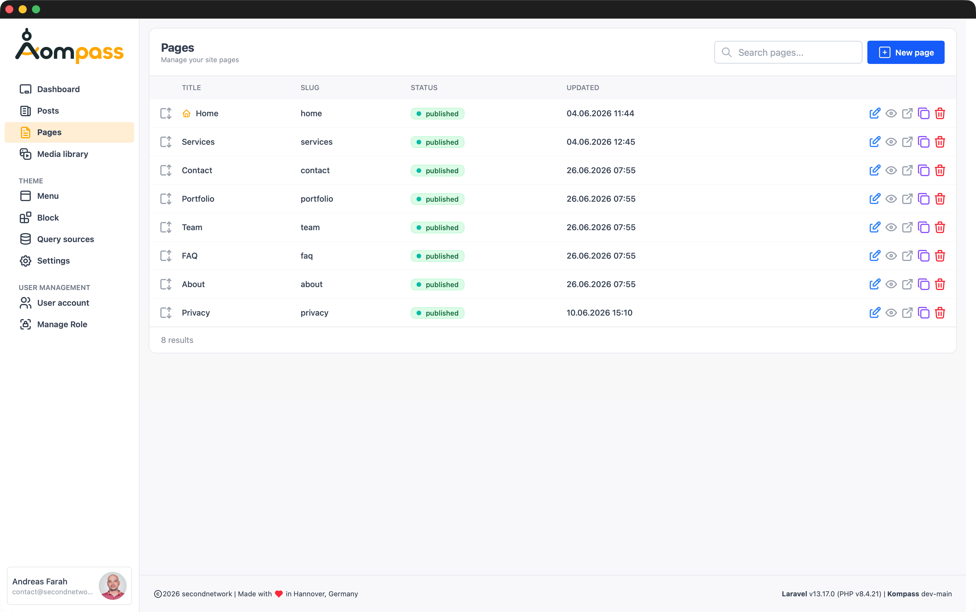
Posts work exactly the same way — the Posts overview lists them with status and last-updated, and editing a post opens the very same block builder:
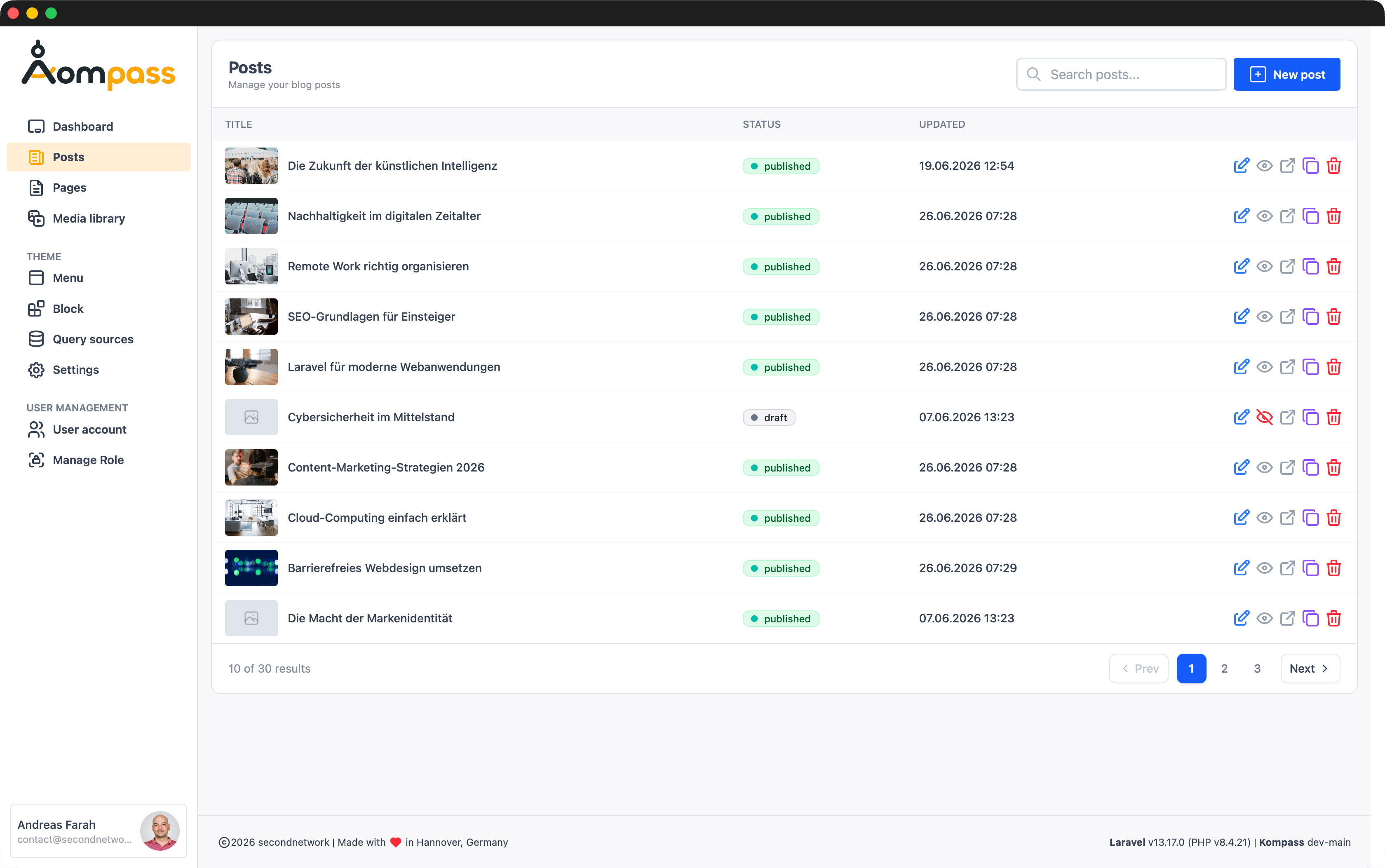
The Layout Block
The Layout Block (the group block type) is the most important structural element in the editor. It's a container: instead of rendering content itself, it holds other blocks and arranges them in a responsive grid. Use it whenever you need columns — a two-column text/image split, a three-up card row, a feature grid.
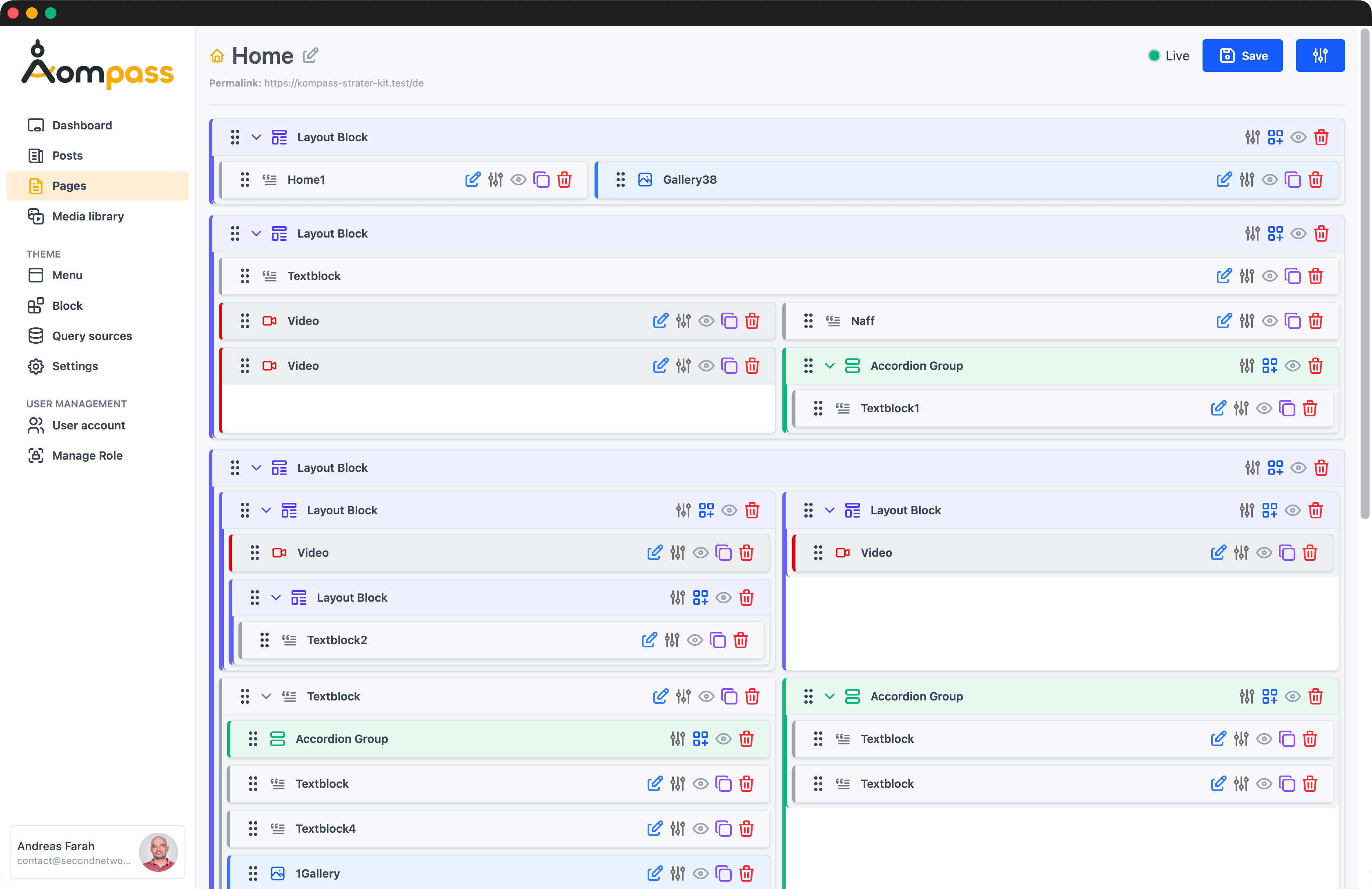
How it works:
- Drag a Layout Block onto the page, then drop other blocks inside it.
- Set the Layout Grid (1–5 columns) on the container.
- Each child block gets a Col Span setting (1–5) instead of Width, controlling how many columns it occupies.
- The container also exposes Align (Top / Middle / Bottom) and Mobile reverse (flip the child order on small screens) so a text-beside-image layout can stack image-first on mobile.
Top-level blocks have subgroup = null; the blocks nested inside a Layout Block carry the container's id as their subgroup and are loaded through the children relation (already eager-loaded in the loading query above). Inside the Layout Block's Blade view you loop over those children:
This is why the render loop skips the wrapping <div> for containers ($isGroup): the Layout Block manages its own grid, so it shouldn't be boxed inside the default single-column wrapper.
Accordion is a container too
The Accordion block (accordiongroup) works the same way — it's a container holding child blocks, but renders them as collapsible panels instead of grid columns. Both use the same $controlsContainer settings.
The standard blocks
Kompass ships with a set of ready-to-use block types, registered under block_types in config/kompass.php. Each maps to a frontend component under resources/views/components/blocks/:
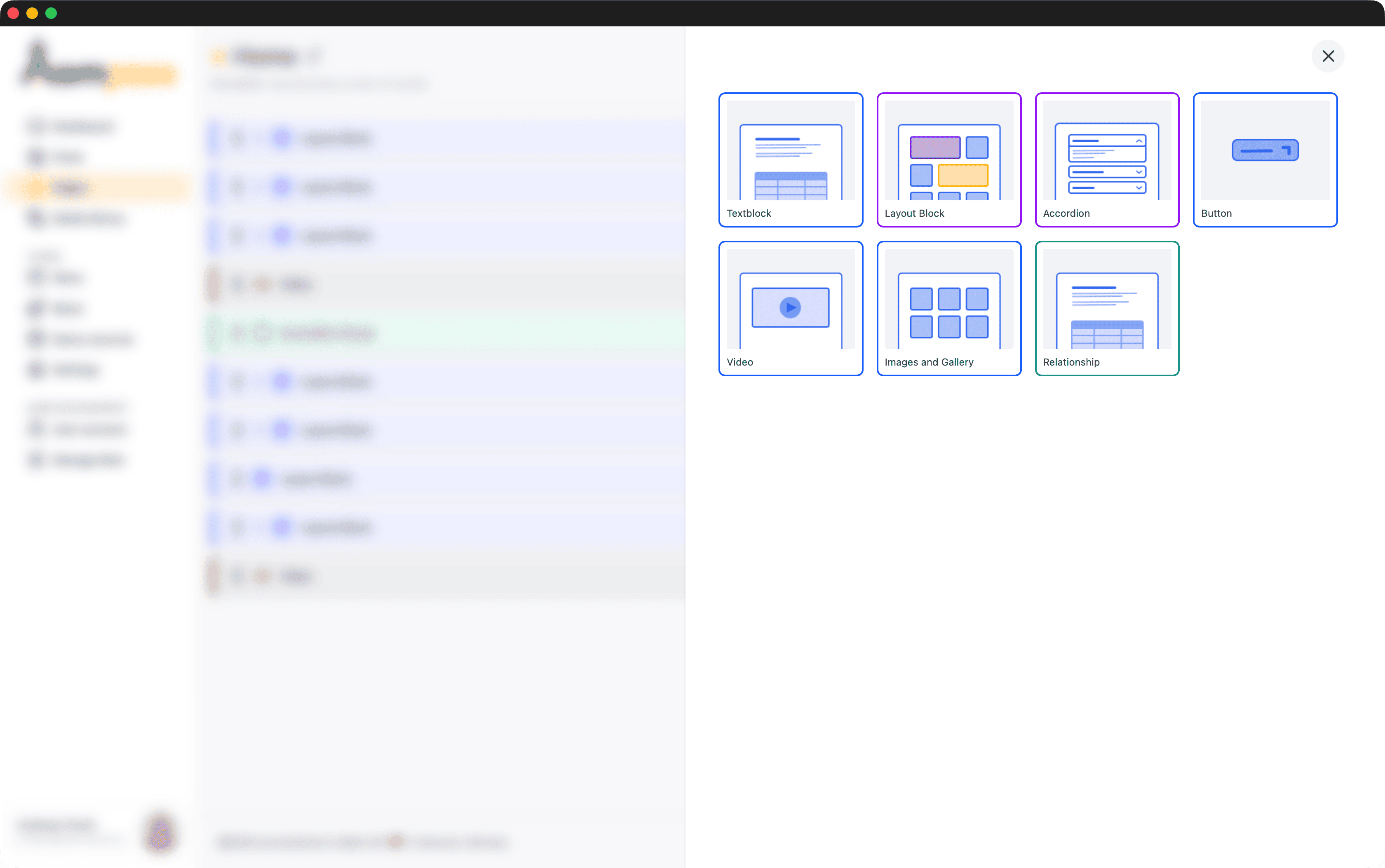
| Block | Type key | Container | What it's for |
|---|---|---|---|
| Textblock | wysiwyg | — | Rich text via the WYSIWYG editor. The default content block. |
| Layout Block | group | ✓ | A responsive column grid holding other blocks. See above. |
| Accordion | accordiongroup | ✓ | A container that renders its child blocks as collapsible panels. |
| Button | button | — | A call-to-action link, styled as a button. |
| Video | video | — | An embedded video. |
| Media | gallery | — | One or more files from the media library. Images render as pictures; non-image files (PDF, doc, sheet, archive, …) render as a download card. |
| Relationship | relationship | — | Pulls records from another model into the page. See Relationship Block. |
Block settings
Selecting a block in the editor opens its settings panel. The panel is split into two parts:
- Content — the block's editable datafields (text, image, link, …).
- Settings — presentation options that don't change the content, only how the block looks and where it sits.
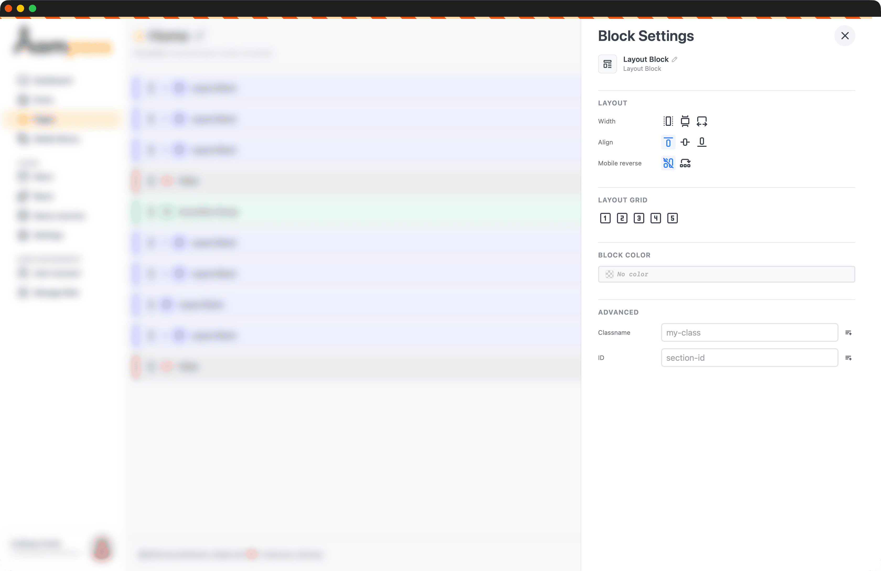
At the top of the panel you can rename the block. The name is just an editor-side label to help you find the block in long pages — it isn't rendered on the frontend.
Which settings sections appear depends on the block type's controls list in config/kompass.php. Most content blocks use the $controlsBasic preset (layout, color, advanced); containers use $controlsContainer (container-layout, layout-grid, color, advanced).
| Section | Setting | Stored as | What it does |
|---|---|---|---|
| Layout | Width — Content, Popout, Fullpage | layout column | How wide the block sits in the page grid. Applied as the class on the block's wrapping <div> in the render loop. |
| Layout | Col Span (1–5) | layoutgrid column | Shown instead of Width when the block is inside a Layout Block — how many grid columns the block spans. |
| Alignment | Left / Center / Right | alignment column | Horizontal alignment (blocks that opt into the alignment control). |
| Block Color | Text / background colour | meta | A colour from the configured color picker swatches. |
| Advanced | Classname | css-classname meta | A custom CSS class, output on the block's <section>. Previously used values are offered as suggestions. |
| Advanced | ID | id-anchor meta | An HTML id on the <section> — useful as an anchor target for the Anchor menu. |
Settings live in meta, content lives in datafields
Block settings are stored separately from content. layout, layoutgrid, and alignment are columns on the block; css-classname, id-anchor, and colour live in the block's meta and are read back with $item->getMeta('key') inside the block's frontend view.
Add your own
The standard blocks are just config entries plus a Blade view. To create your own, see the Block Builder and Configuration File → Block Types.